REALBasic Application Development - Part 1
23 December 2024
Introduction
This tutorial will introduce you to the basics of REALBasic by guiding you through the creation of a simple Mac OS application. You'll build a basic GUI window where users can interact with the app by pressing buttons to trigger various actions.
This tutorial assumes you are using REALBasic 3.5.2, or 5.5.5 for Mac OS.
Download the project assets and completed project code below:
Project Basics
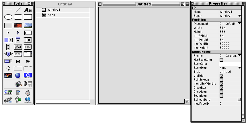
When starting a new project in REALBasic you will be presented with two windows, and two panels. The window that lists "Window1" and "Menu" is your Project window. This lists all Windows, Classes, Modules, Assets and other project data.
The window titled "Untitled" is a preview of the default window (Window1) of your application. Within this window you can add user interface elements (controls) by dragging them from the Tools panel into your window. You can use the Properties panel to modify many aspects of your application. For example, when an application window is open and you haven't selected a control you can modify the properties of the window. If you've selected a control within a window the properties panel will display properties related to your selected control.
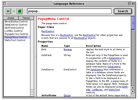
While working on any project the REALBasic Language Reference is incredibly helpful. This is found within the Help menu, or by pressing the key combination Command + 1.
Building a window
Before we start building an example application, select the "Help" menu and click "Show balloons", then move your cursor over each control in the Tools panel. Once you're accustomed to each control, turn off balloons in the help menu again.
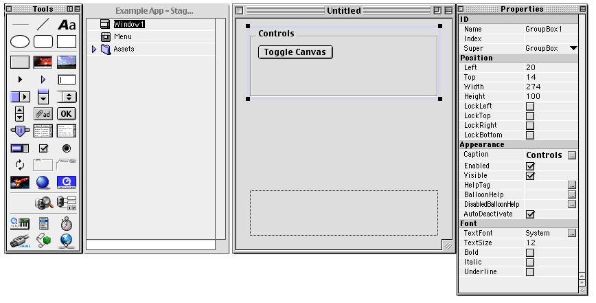
Now we want to add a Canvas control to our application window. Drag the Canvas control from the Tools panel into Window1. Next, add a GroupBox control, and then drag a button inside this. Select either the GroupBox or PushButton control that you've placed inside the window, and then change the caption to "Controls", and "Toggle Canvas" in the Properties panel.
Adding Assets
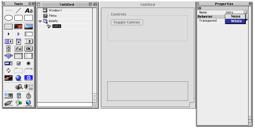
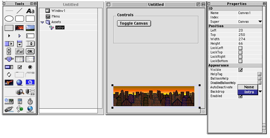
Now in the Project window click the "File" menu and select "New Folder". When the folder is created, select it, and rename it to "Assets" in the Properties panel. From your desktop drag an image file (PICT format), or the image from the downloaded project assets into this folder. When the image has been added you can adjust it's transparency options within the Properties panel. If you've selected "White" within the transparency options, this colour will be treated as transparent within any window.
If you go back to Window1 and select the Canvas control, you can apply the image within the Properties panel by setting the Backdrop property.
Adding Functionality
To add some functionality to the application, you need to open a control. This can be done by double clicking on a control within your window. Start by opening the "Toggle Canvas" button.
A Code Editor window will open where you can add code to many different types of events relating to that particular control. You can also access other controls within this window, along with window Events, Menu Handlers, local Methods etc. For now we want to edit the "Action" event of the button. This is the event associated with a button click.
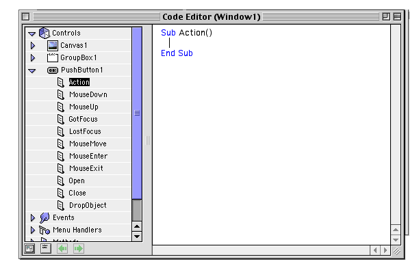
Within the code editor you will see `Sub Action()` and `End Sub` already written. This defines the subroutine definition which will contain the instructions we will provide.
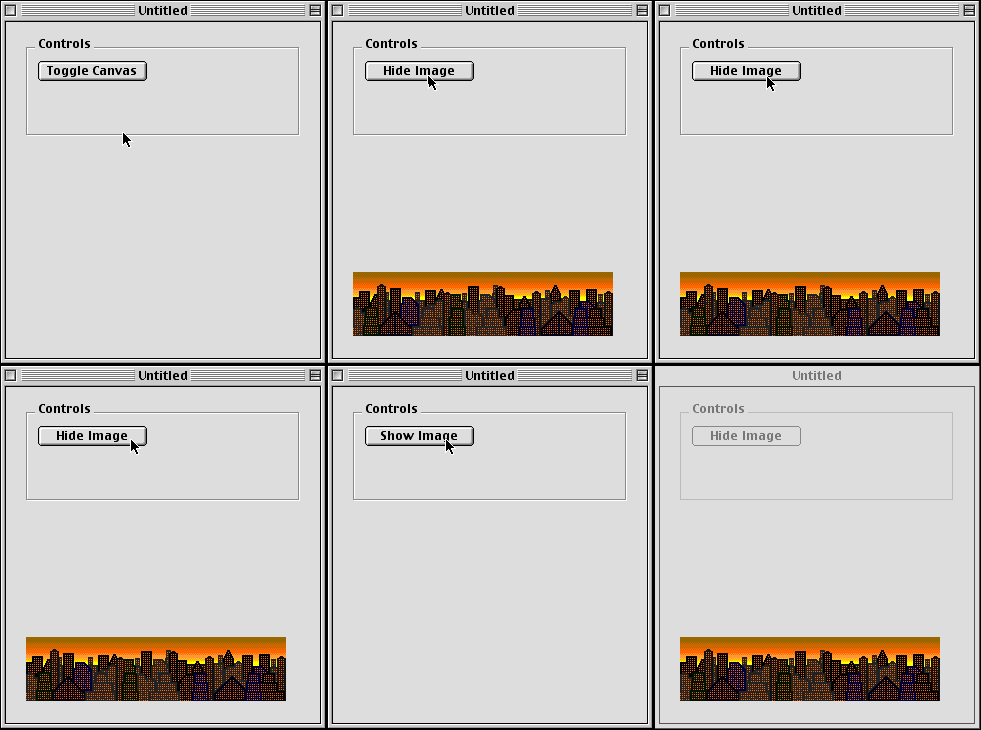
We are going to add functionality so that the "Toggle Canvas" button shows and hides the image within the application window. To do this, we need to check if the canvas' "Backdrop" property is currently empty. If it is empty, then we should set it to our image asset that we added previously. Otherwise if the "Backdrop" property is already set, then we should clear it.
Within the subroutine, write the following:
If Canvas1.Backdrop = Nil Then
    Canvas1.Backdrop = Intro
Else
    Window1.Canvas1.Backdrop = Nil
End If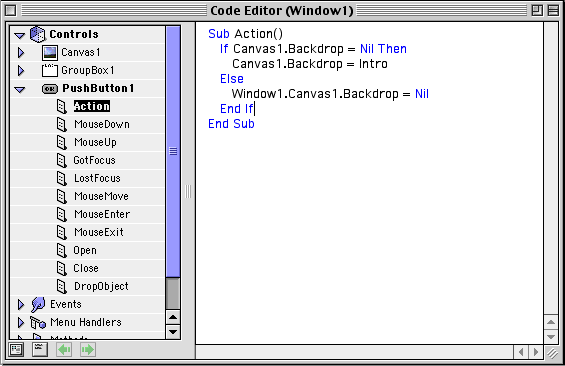
We can alter our Canvas control within a subroutine by using its property name "Canvas1". "Intro" is the filename of the asset we added, and we haven't changed its name in the Properties panel so we can access it directly by "Intro".
You may have noticed that we used two different methods of accessing the Canvas1 control of Window1 in the code editor. A window has access to all of the Controls within it. This means we can access a control directly like this: Canvas1.Backdrop = Nil
You can also access a control through its parent window like this: Window1.Canvas1.Backdrop = Nil
This is necessary when you want to access controls from other windows, since the current window/subroutine doesn't have direct access to it. For example, if we wanted to update a Canvas element within another window (e.g. Window2) we would access it like this: Window2.Canvas1.Backdrop = Nil
Building and Running an Application
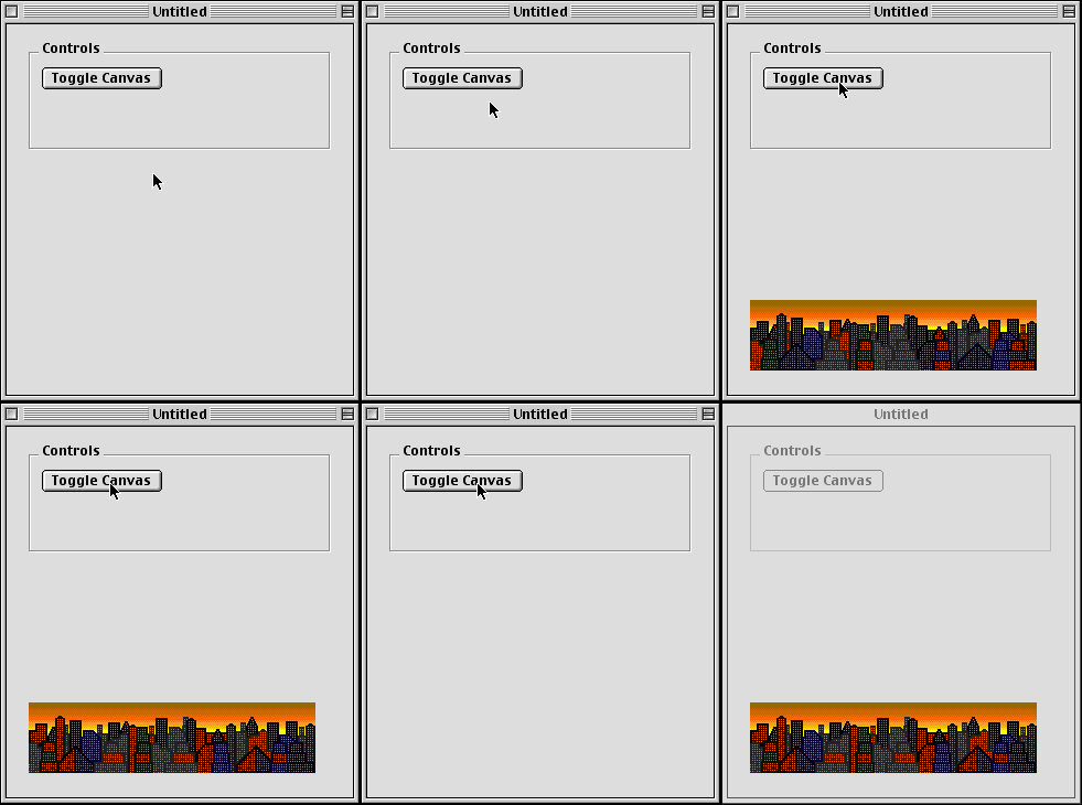
Now that we have some basic functionality within the application, we need to test it. In the Debug menu, select "Run", or press Command + R. This will build and run your application. When the application is built, test your "Toggle Canvas" button to see if it works. When you're finished testing, Quit the application within the File menu, or press Command + Q.
Reactive Changes
To make the button more intuitive, we should update the button's caption so that when no image is displayed, the caption should be "Show Image", and when an image is displayed it should be "Hide Image".
Open the "Action" subroutine for the button again and update the code to the following:
If Canvas1.Backdrop = Nil Then
    Canvas1.Backdrop = Intro
    Me.Caption = "Hide Image"
Else
    Window1.Canvas1.Backdrop = Nil
    Me.Caption = "Show Image"
End If
Me.Caption is a shorthand way of referring to the current control's "Caption" property. When we're editing the action event of "PushButton1", we can use Me.Caption as a shortcut for PushButton1.Caption.
Build your application to test the new functionality.
Up Next

|
REALBasic Application Development - Part 2Continue building the example application. |

Post a Comment